
Increase Response Rates With Better Online Forms
Incorporating online forms is standard practice for websites and landing pages. Including one is a great way to collect information on potential prospects or customers, but the art of online forms can be a tricky concept to master. Getting online visitors to actually fill out the forms and surrender their information can be difficult. There are many factors to consider when creating a form.
Before you start sprinkling random forms on your website, you should first determine what the goal or purpose is for the form. Do you want to increase the number of subscribers to your newsletter? Cultivate new leads for prospective clients? Expand your distribution for your monthly specials email?
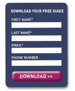
Keep in mind that online visitors are more likely to complete a form if they feel that they will receive something of value in return. This might be receiving access to download valuable information, receive a discount or more details about a product or service you offer. As online experience has grown, people have become more savvy about providing their information. Once you’ve established the purpose of the form, you’ll need to decide what information is needed from the prospect. Studies have shown that having fewer fields to fill out on a form increases the rate of completions. In one case study, a form that initially had 11 fields to fill out, when replaced with a 4 field version, resulted in form completions increasing by 160%. Once a form goes beyond 6 fields to fill, the completion rate drops dramatically. When a field is required, make sure to make that clear by either stating “required” or using a * in the form label. Accurately label all forms and always include a headline with information on why a visitors should fill out the form. The goal should be to collect just enough information to “start the conversation” with the prospect.
Next, you’ll want to think about design. Forms should be organized, visually attractive and easy to use. As far as what order the fields should be in, start with the easiest fields to complete and then move to the harder fields. Make sure that each field on the form is clearly labeled. Use easy to read colors that provide a good contrast with the background.
At the end of the form you’ll need to include a “call to action” or submit button. Don’t use the word “submit” in the button. Forms using the word “submit” have a 3% decrease in conversion rate. Research shows that words, like “click here” or “go” that suggest less commitment tend to perform better.
Don’t forget to include a thank you page, which prospects who submit a form are automatically directed to. On this page, be sure to thank them for completing your form and let them know when and how you will be responding. Since they have already shown interest in your business, content on the thank you page can direct them to a relevant page on your website for them to explore more of your site content. If you were offering access to download content, give clear instructions on how they can obtain that information.
One important thing to keep in mind is timing of online interactions. When a person completes a form, they are expecting a quick response. So, before you go live with any form, establish a process for replying to forms that are submitted. Planning should include determining who will be receiving form notifications, who is responsible for replying, as well as what the response(s) should be. Finally, be sure to keep track of form submissions and the outcome of the interactions with the prospects, so that you can make adjustments to the form and response process as needed.